

Welcome back 👋. In this installment of Learning MDX Deck, I will go over MDX Deck’s built-in layouts. It is also possible to create your own layouts. I won’t cover that here, but you can read about it in the MDX Deck documentation. So lets get right to it. Here is what MDX Deck provides for layouts out of the box.
Layouts for MDX Deck are React components. To use a one, you first need to import it.
1 | import { LayoutName } from 'mdx-deck/layouts' |
Because each slide can use a different layout, multiple layouts can also be imported all at once.
1 | import { LayoutName1, LayoutName2, LayoutName2 } from 'mdx-deck/layouts' |
Once the layout is imported, place your content inside its component tags as shown below, making sure to place newlines around content items. Failure to use newlines can cause the slide to render incorrectly. Optionally, you can put content above or below the layout component.
1 | # SLIDE TITLE |
Now that we know how to use the MDX Deck layouts, lets take a look at all the built-in options.
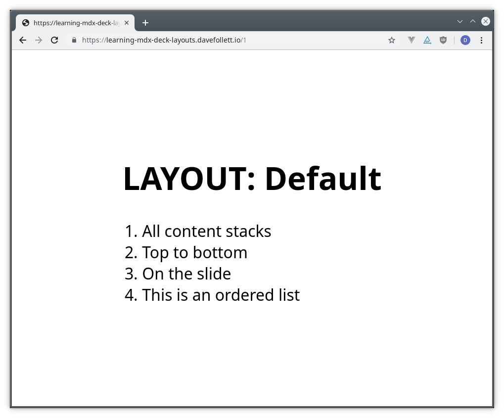
Default
The absence of specifying a layout component will provide the default behavior of stacking all content vertically on the slide from top to bottom.
1 | # LAYOUT: Default |
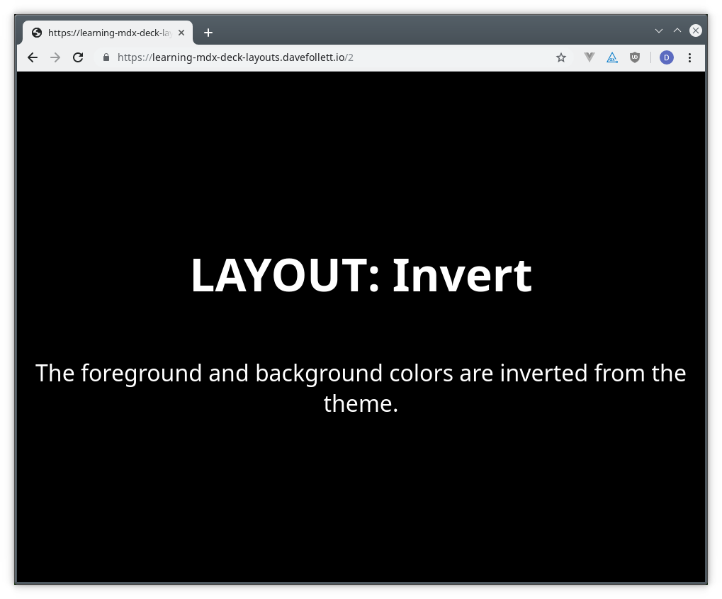
Invert
The Invert layout stacks content vertically like the default layout but it reverses the theme’s foreground and background colors.
1 | import { Invert } from 'mdx-deck/layouts' |
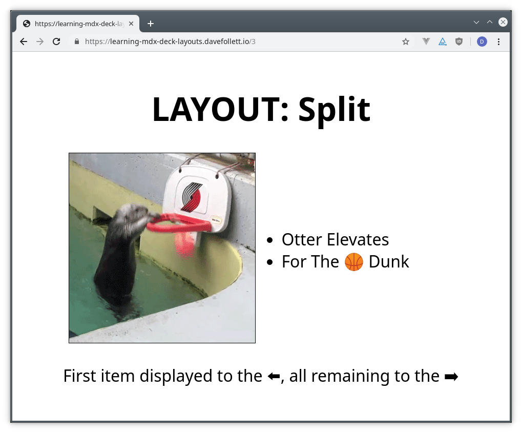
Split
The Split layout divides the slide into two vertical columns; left and right. The first item will display on the left and all additional items will be stacked vertically on the right.
1 | import { Split } from 'mdx-deck/layouts' |
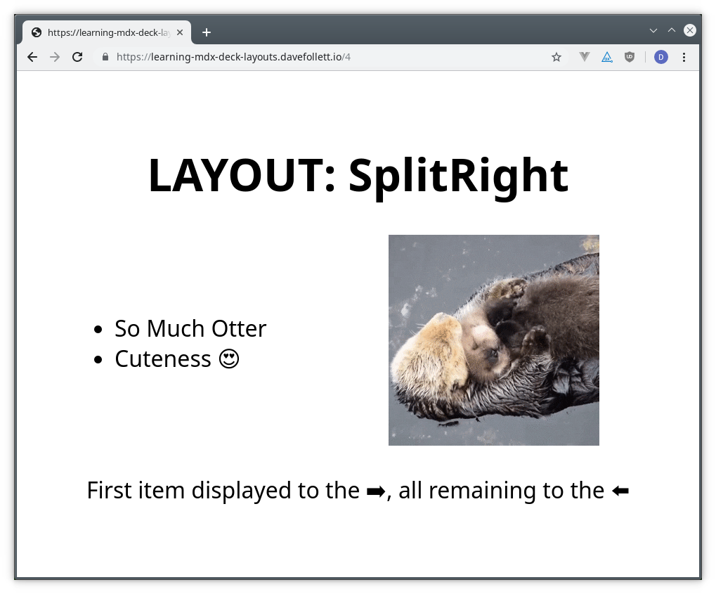
SplitRight
The SplitRight layout is the reverse of the Split layout. The first item will display on the right and all additional items will be stacked vertically on the left.
1 | import { SplitRight } from 'mdx-deck/layouts' |
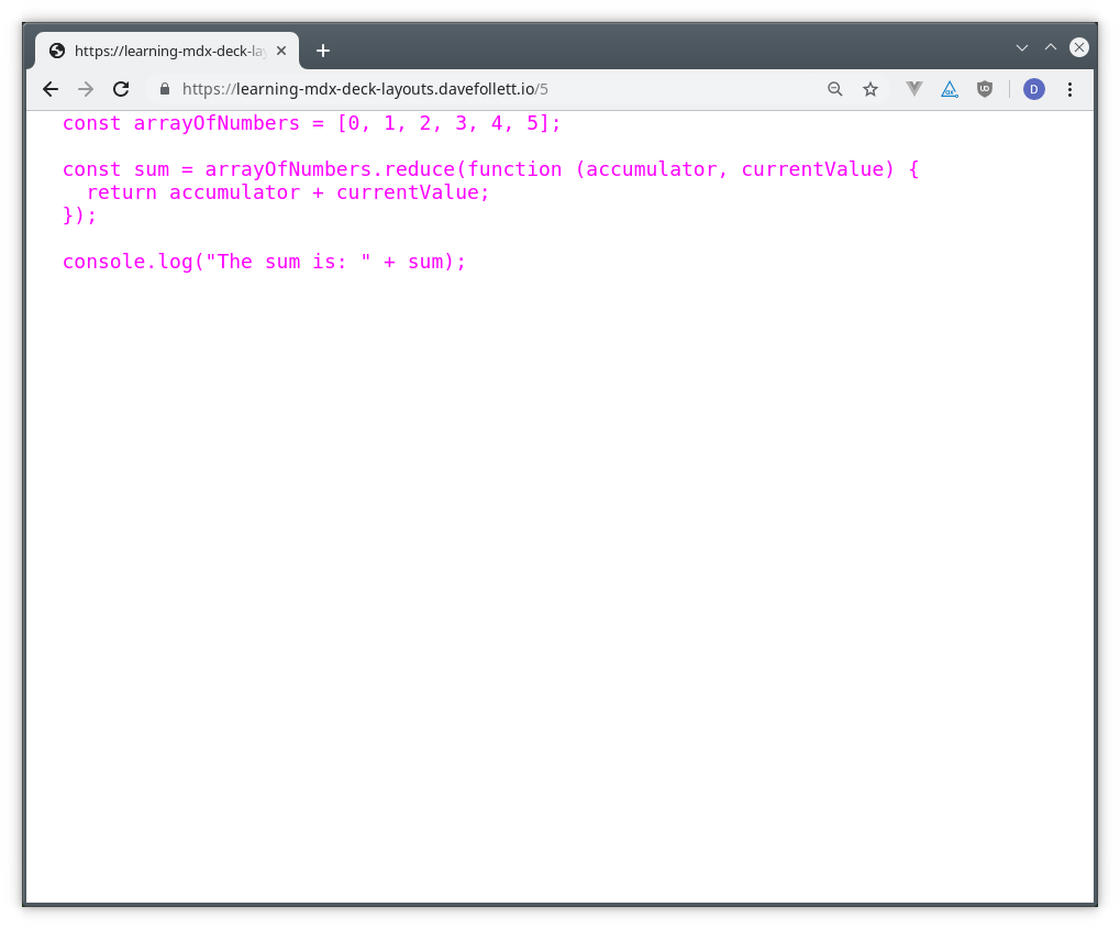
FullScreenCode
The FullScreenCode layout will display code blocks fenced by three back-ticks using the full screen.
1 | import { SplitRight } from 'mdx-deck/layouts' |
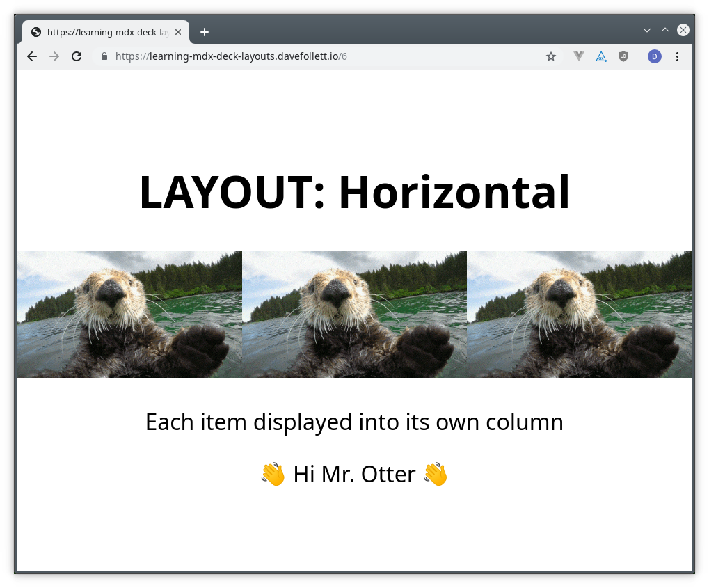
Horizontal
The Horizontal layout is the reverse of the default layout. Inside of stacking content vertically (top to bottom), it stacks the content left to right horizontally.
1 | # LAYOUT: Horizontal |
🏁 Conclusion
As you can see, MDX Deck provides a solid set of layouts that will cover most presentation needs. All the code used for this article can be viewed using the following references.
CodeSandbox.io
GitHub repository
https://github.com/davefollett/learning-mdx-deck-layouts
Deployed to Netlify
https://learning-mdx-deck-layouts.davefollett.io
🔜 Up Next
Next in the Learning MDX Deck series we will explore MDX Deck’s built in theme options. I’ll add a link here when it’s published.